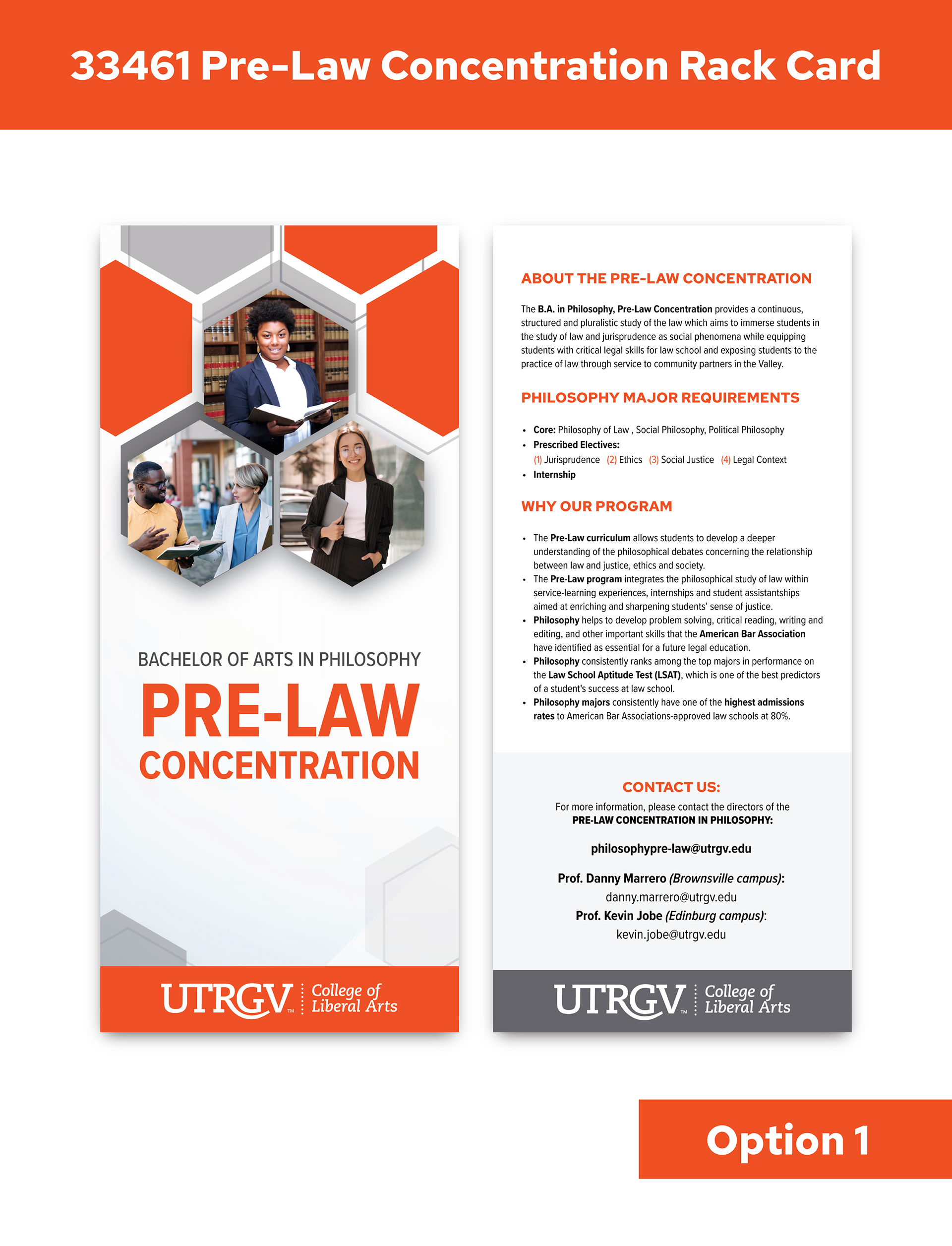
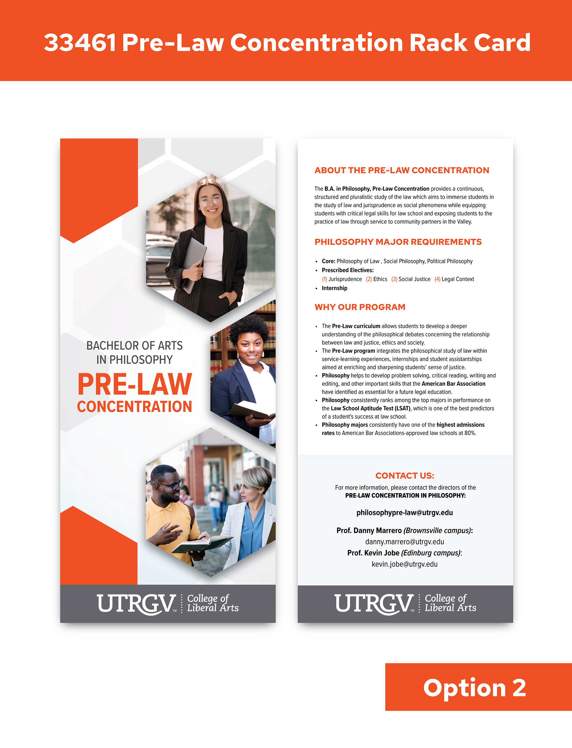

I started the branding off by creating three different options for a rack card. The pre-law concentration program is part of the college of liberal arts, which has its own branding elements it typically sticks to, like the hexagons and the utrgv official colors. With this knowledge, I created layout options that are true to their branding but also feel fresh and new. I wanted to add dimension to the design, so I incorporated the use of drop shadows and transparency of the hexagons to create dimension between the background hexagons and the ones in the foreground. As per the client's request, I also incorporated "Law school student" imagery onto the front of the rack card.
The client went with option 3, so that is the branding style I continued with for the rest of the project.
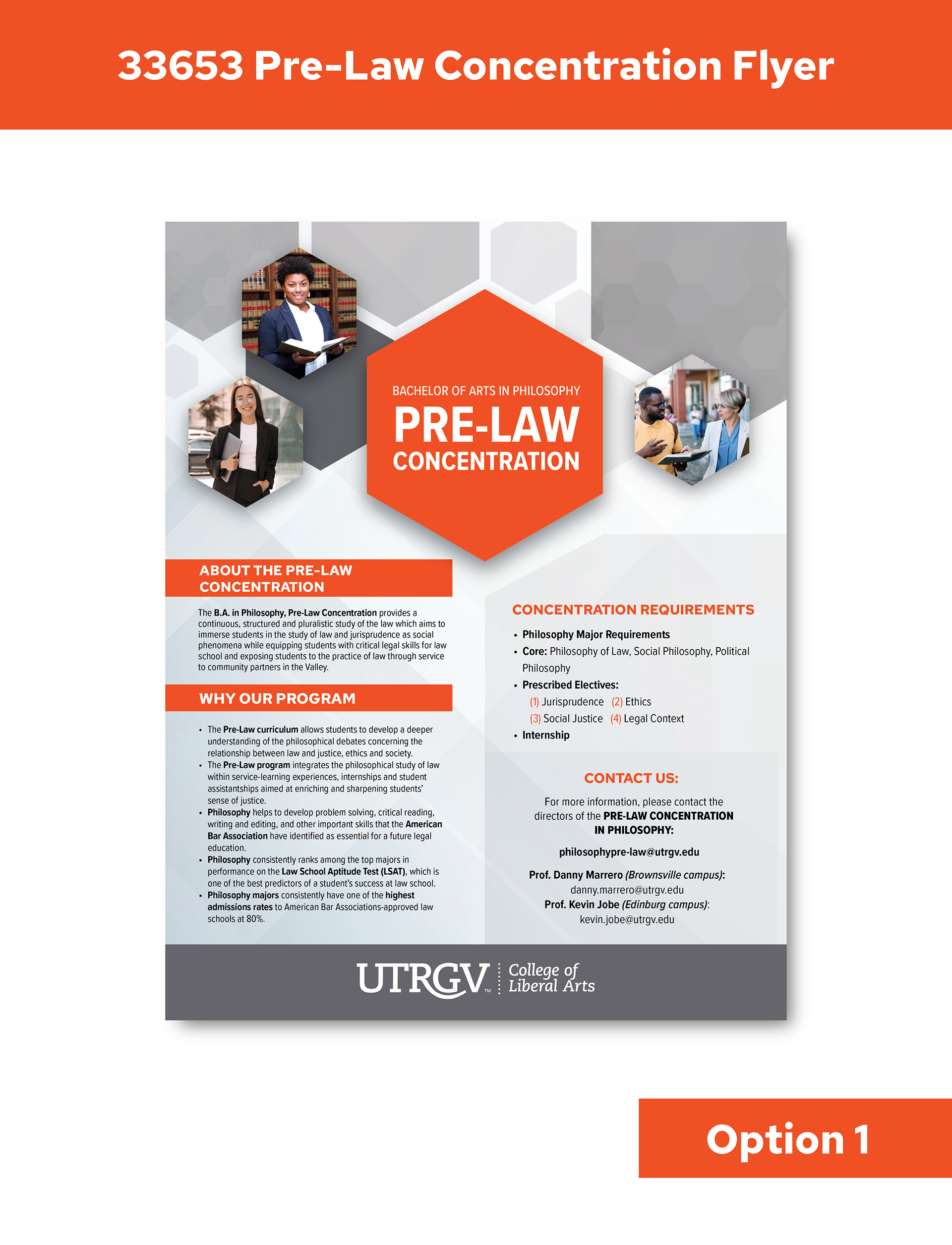
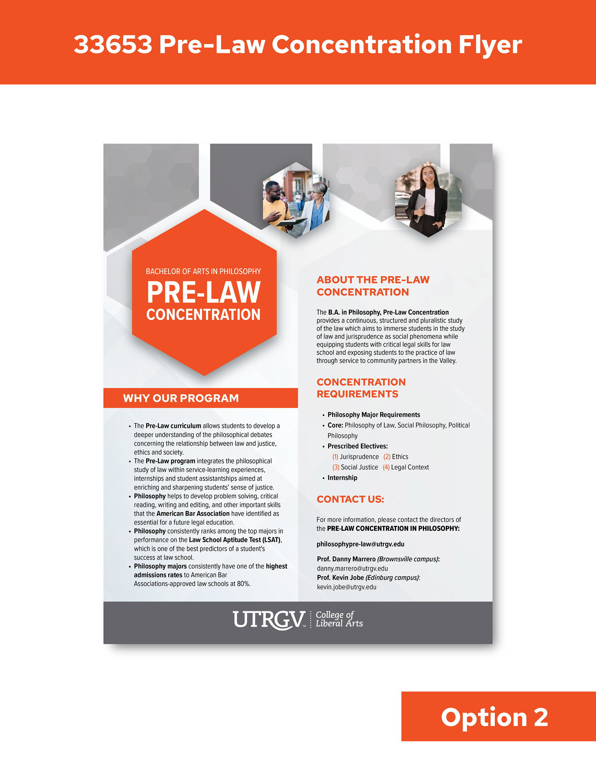
My next task was To create flyer options for them using the branding style from option 3. I created these two layouts which consisted of the same imagery and information from the rack card.
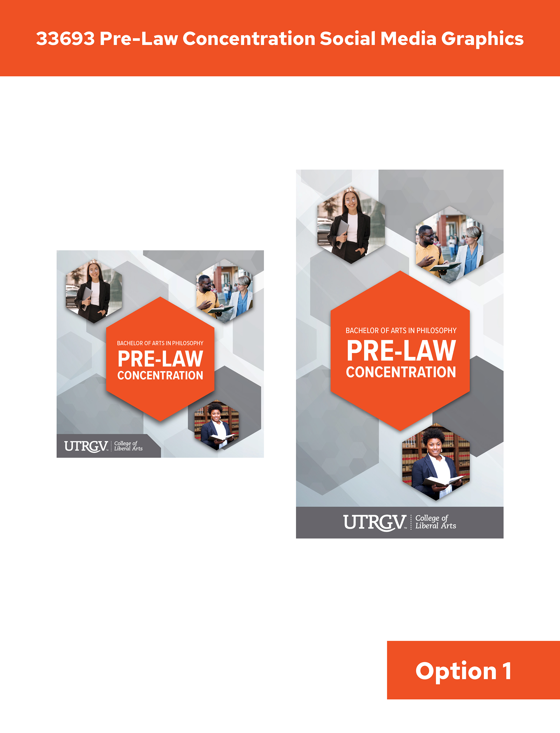
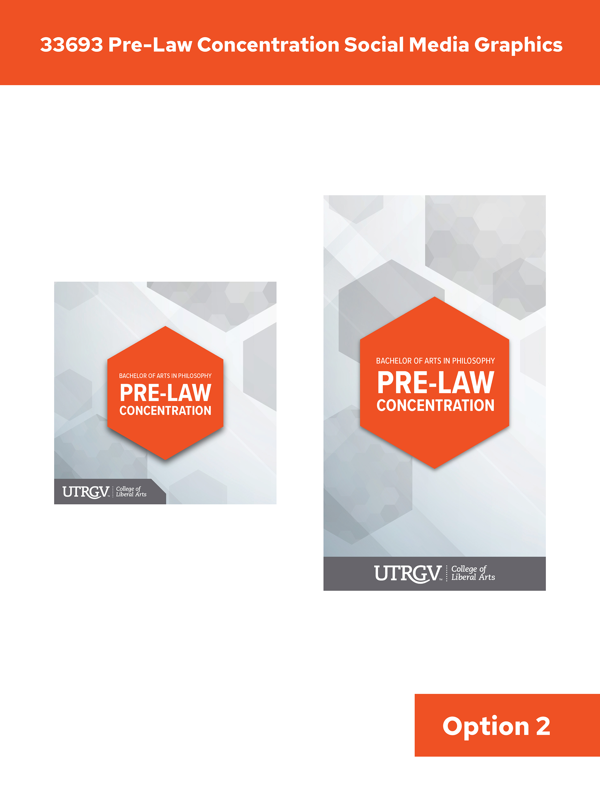
Lastly, I created two social media graphic options for the client. One included imagery and darker hexagons, and the other had no images and a lighter background in case the client would like to add their own text to their post. The client went with both options.